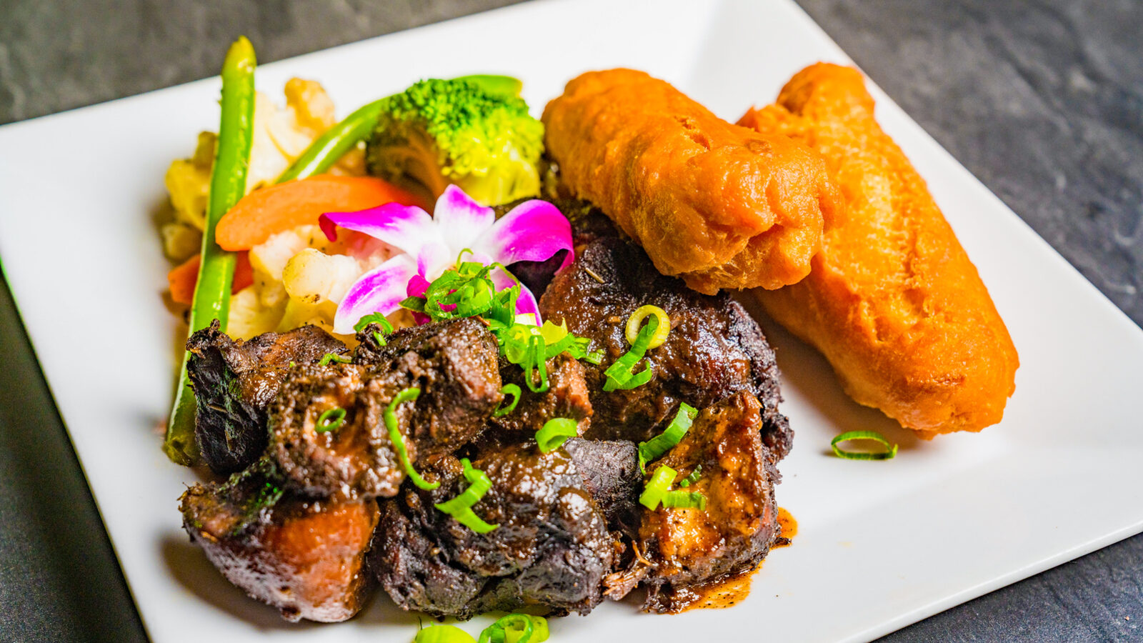
Two photographs of the same dish.
Both are sharp. Both are well composed. If you put them side by side, most people would call it a tie. One of them brought in eleven reservations the week it ran. The other brought in compliments.
What separates them is not quality. It is intent. And once you can see the intent, you will never look at a food photo the same way again.
Start with the photo that got compliments. It was shot from above, the whole plate in frame, perfectly centered, the way a menu designer would want it. It looks like a catalog. It is informational. It tells you what the dish is.
The photo that got reservations was shot from the side, close, with the back of the plate falling out of focus. You cannot see the whole dish. You can see the sauce pooling against the rim, the steam, the one piece that is about to be picked up. It does not tell you what the dish is. It tells you what it would be like to be sitting in front of it.
That is the whole difference, and it runs through everything.
Content that looks good describes. Content that converts puts the viewer at the table.
Think about what a stranger is doing when your post appears. They are deciding, in a second, whether this is a place they could see themselves. Not whether the food is objectively good. Whether they can picture the evening. The catalog photo asks them to evaluate. The side-lit photo lets them imagine. People do not make reservations from evaluations. They make them from imagination.
There is a measurable version of this, and it comes from the delivery platforms, which have the data to prove it. DoorDash found that restaurants with photos on at least half their menu see an average sales lift of 13 percent. Grubhub says menus with images get 70 percent more orders. Nobody changed the food. They changed whether a person could see it, and sales moved by double digits.
Now take that same principle and apply it to video, because video is where the gap between "looks good" and "converts" gets wide.
A video that looks good is a montage. Ten dishes, two seconds each, a song, a logo. It is impressive and it is forgettable, because nothing in it happens to the viewer. A video that converts is one dish, one moment. The spoon going into the crème brûlée. The cheese pull held a beat too long. The pour. It is slower, it is smaller, and it is the one that gets sent to a friend with the words "we're going."
Here is the pattern, if you want to check your own feed against it.
Converting content has three things. A plate you can taste, which means light, angle, and distance chosen so the texture is the subject. A place you can picture yourself in, which means the room, at the hour people actually eat, with people in it. And a reason to come this week, which means the post is tied to something real and finite, a dish, a night, a table.
Most restaurant feeds have none of the three and wonder why the likes never turn into covers. The ones that fill rooms have all three, every week, on purpose.
Which brings us back to the two photographs.
The same chef cooked both plates. The same camera took both pictures. The only thing that changed was that someone decided, before pressing the shutter, what the viewer was supposed to feel. That decision is the entire craft, and it is why "we'll just have the staff take some pictures" costs more than it saves.
We make that decision for restaurants in New York, on every plate and every frame. If your food is better than your feed, the gap is not your food.